See the large-cap vs. small-cap debate with a direct comparison to RRG | RRG chart

key
gist
- Check Large-Cap and Small-Cap Sector Rotation Using RRG
- The current strength of small-cap and large-cap stocks is clear.
Late last year, I wrote a blog article about the relationship between large-cap and equal-weight sectors. This involved plotting the ratio of large-cap sector ETFs to equal-weight sector ETFs.
If you missed that article, you can find it here.
Today I want to extend this approach to the large-cap vs. small-cap debate and bring the level of detail down to a direct comparison at the sector level.
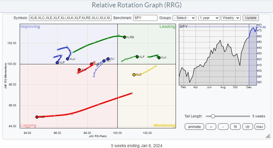
Large Cap Rotation

Above is the most widely used relative rotation graph for the US sector.
Observations from this RRG:
- Energy quickly loses its relative intensity.
- Real Estate, Finance and Technology remain strong within the leading quadrant despite a slight decline in relative momentum.
- Telecommunications Services could line up to level the JdK RS-Momentum within the weakening quadrant and pivot back to the lead.
- Industrials and Consumer Discretionary continue to improve slowly within the improving quadrant, but in a positive RRG direction (+).
- The material rotates down again and crosses into the lag.
- Consumer Staples and Utilities are falling back into the lagging quadrant, maintaining very low JdK RS-Ratio readings.
- Healthcare is still within the lagging quadrant but is showing a sharp upward trend. It’s early days, but there are improvements.
small cap rotation

This is the RRG equivalent of Small-Cap.
Real estate is included in the Financials small-cap ETF. PSCF and telecommunication services are included in the utility.
To better handle the rotation, I’ve turned off the long, disconnected tail of the energy sector (PSCE) in the graph below. This causes the image to become distorted.

Key observations from this RRG include:
- Consumer Discretionary, Financials and Materials are within the leading quadrant, but only Materials is in a positive RRG direction. Discretionary and financial stocks have already started to lose relative momentum.
- The Industrials sector still maintains high RS-Ratio numbers, but has rotated (temporarily?) into the weakening quadrant.
- Utilities are potentially the weakest (small-cap) sector, with a strong rotation from improving to lagging.
- Technology and consumer staples are both within the lagging quadrant. Technology has seen significant improvement over the past four weeks, while consumer staples have recovered sharply over the past week.
- Although the healthcare sector is the only one improving, the highest figure on the JdK RS-Momentum scale is promising.
By comparing these two relative rotation graphs, we can already understand how rotation occurs in these two universes.
However, both universes were constructed based on common benchmarks. The Large-Cap universe is organized against SPY and the Small-Cap universe is organized against $SML.
Large-cap vs. small-cap stocks by sector
To further explore the relative performance of each large-cap and small-cap sector, I created a ratio universe where each symbol is the ratio of the large-cap sector to the small-cap sector. sector.

*Click on the image to open the live RRG on the site. You can save it as a bookmark in your browser by clicking the permanent link at the bottom of the page.
Since the universe is made up of ratio symbols, we need to adjust the benchmark to $ONE so that RRG shows the absolute trend of these ratios.
It becomes immediately apparent that most of these tails are either pointing towards the lag quadrant or are already pointing or rotating inward.
The technology and healthcare sectors are still doing decently in the weakening quadrant, giving them plenty of room to recover without hitting the retreating quadrant. Utility companies were the first to try this.
Within the lagging quadrant, consumer discretionary is starting to gain relative momentum, but it’s in its infancy.
Ultimately, this means that large-cap stock rotation is occurring in almost all industries. The only sector where investors should clearly favor large-cap stocks is energy. This is because the tail of XLE:PSCE is being pushed further into the leading quadrant.
#StayAlert, –Julius
Julius de Kempenaer
Senior Technical Analyststockchart.com
creatorrelative rotation graph
founderRRG research
owner of: Spotlight by sector
Please find my handle. social media channels It’s under Bio below.
Please send any feedback, comments or questions to Juliusdk@stockcharts.com.. We cannot promise to respond to every message, but we will ensure that we read them and, where reasonably possible, utilize your feedback and comments or answer your questions.
To discuss RRG with me on SCANHey, please tag me using your handle. Julius_RRG.
RRG, Relative Rotation Graph, JdK RS-Ratio, and JdK RS-Momentum are registered trademarks of RRG Research.

Julius de Kempenaer is the creator of Relative Rotation Graphs™. This unique way to visualize relative strength within the world of securities was first launched on the Bloomberg Professional Services Terminal in January 2011 and made public on StockCharts.com in July 2014. After graduating from the Royal Netherlands Military Academy, Julius served in the Dutch army. Airmen of various officer ranks. He retired from the military in 1990 with the rank of captain and entered the financial industry as a portfolio manager at Equity & Law (now part of AXA Investment Managers). Learn more


