Market Structure Patterns – Introduction – Trading Systems – 31 March 2025

Market structure in trading refers to the price formation and the patterns that prices creates on a chart. Understanding market structure helps traders to identify market direction and predict potential moviments that offers oportunities of trading with low risk and high probabilties.The core components of market structure are highs, lows, higher highs (HH), higher lows (HL), lower highs (LH), and lower lows (LL), which serve as the foundation for defining various market phases and concepts. In this post we will talk about some of them: market phases, swings highs and swing lows, market cycles and the fractal characteristic of liquidy markets.
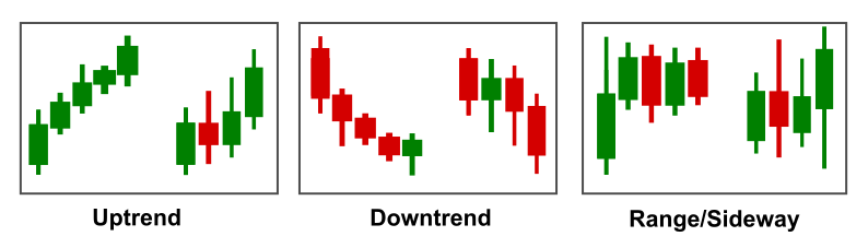
Market Phases
- Uptrend: Characterized by a series of higher highs and higher lows. The market structure shows a consistent rise in prices, indicating strong buying interest.
- Downtrend: Characterized by a series of lower highs and lower lows. The market structure shows a consistent decline in prices, indicating strong selling interest.
- Range-bound (Sideways Market): Occurs when the price moves between a horizontal support and resistance level. There are no clear higher highs or lower lows, indicating a balance between buying and selling pressure.
Swing Highs and Swing Lows
Market structure refers to the way price behaves and forms patterns on a chart. These patterns help traders understand the direction of the market, anticipate future movements, and identify trading opportunities with high probability and low risk. The core components of market structure are highs, lows, higher highs (HH), higher lows (HL), lower highs (LH), and lower lows (LL), which serve as the foundation for defining various market phases and concepts.
A common way of analyzing market structure is by looking at the highs and lows of individual periods (often represented by a candle or bar). However, a more refined approach is to observe swing highs and swing lows. These concepts are key to understanding broader trends, ranges, and reversals.
A swing high is the highest point within a specific swing of price movement, followed by a price decline. A swing low, on the other hand, is the lowest point within a swing, followed by a price increase. A swing is essentially a series of price movements in one direction—either up or down. These swings can be thought of as the natural “waves” of price action on a chart, creating a rhythm of rising and falling prices over time.
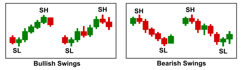
By identifying swing highs and swing lows, traders gain a clearer understanding of the broader market structure. This method allows for the analysis of trends and reversals over longer periods compared to simply looking at the high and low of individual candles or bars.
-
In an uptrend, we see a sequence of higher swing highs and higher swing lows. This pattern mirrors the idea of higher highs (HH) and higher lows (HL), indicating a sustained price increase and strong buying interest.
-
In a downtrend, the market makes lower swing highs and lower swing lows, much like the lower highs (LH) and lower lows (LL) of a downtrend, indicating ongoing selling pressure and price decline.
-
In a range-bound market, swing highs and swing lows occur in a horizontal pattern, where price moves within a defined support and resistance range without forming clear higher highs or lower lows. This shows a balance between buying and selling pressures.
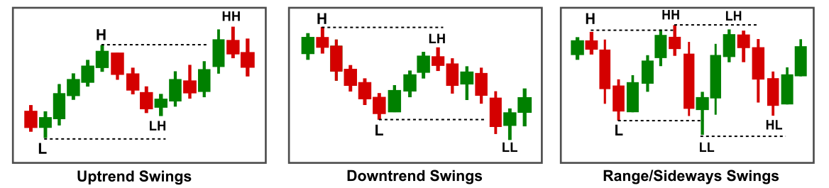
In basic market structure analysis, traders often focus on the highs and lows of a single period (like a candlestick or bar). This can help identify the immediate trend and market conditions. However, the swing analysis takes into account the broader context of price movement, focusing on a sequence of highs and lows over a series of periods, making it easier to identify trends, reversals, and consolidation phases.
For example, a single candle might represent a price move from a low to a high, but by looking at the swing high and swing low, we can better understand the overall momentum of the market. Identifying swing points can give traders insight into the broader trend, as well as the potential for reversals or continuation.
Market Cycles
Once we incorporate the concept of swing highs and swing lows, we can begin to see the market as a series of market cycles. A market cycle represents the continuous ebb and flow of price movements from one extreme to another. These cycles typically consist of four phases:
-
Accumulation/Re-Accumulation Phase: The market is range-bound, with price moving sideways as buyers and sellers find a balance. This phase often occurs after a downtrend, where smart money accumulates positions before a potential upward move.
-
Markup Phase (Uptrend): In this phase, prices rise as demand outweighs supply, creating a series of higher swing highs and higher swing lows. This is the uptrend phase, where market sentiment shifts toward bullishness.
-
Distribution/Re-Distribution Phase: After an uptrend, the market enters a period of consolidation or sideways movement. Price may fluctuate within a range as smart money distributes their holdings to the retail traders. Swing highs and swing lows become more horizontal.
-
Markdown Phase (Downtrend): The final phase of the market cycle is characterized by a decline in price, with lower swing highs and lower swing lows. This is the downtrend phase, where selling pressure dominates.
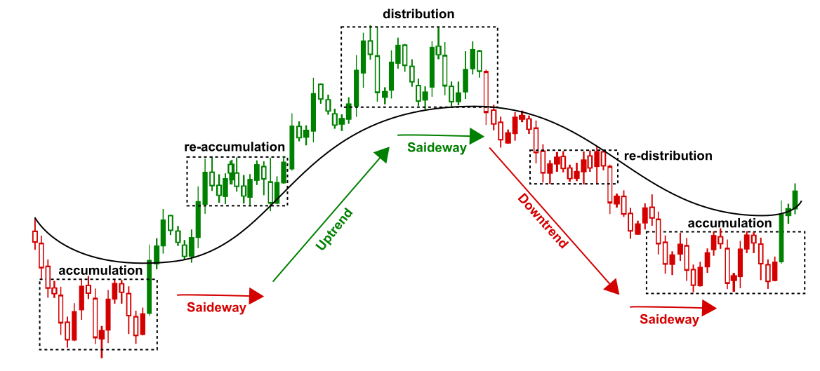
By observing swings, traders can recognize these phases more effectively, providing better context for entering or exiting positions. Market cycles help to identify the larger market trends and the shift from accumulation to markup and from distribution to markdown.
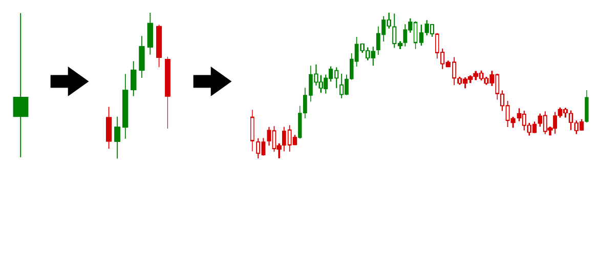
Fractal Behavior in Liquid Markets
One of the most fascinating characteristics of liquid markets is their fractal nature. A fractal is a pattern that repeats itself at different scales, and this principle applies seamlessly to the way markets move. Whether you’re looking at a one-minute chart or a monthly chart, the same principles of market structure—swings, highs, lows, trends—remain consistent, just on different timeframes.
Fractal Behavior in Liquid Markets: The Same Movement, Different Scales
One of the key features of liquid markets is their fractal nature—the idea that the same patterns repeat at different timeframes. What we see as a single candle or period on a higher timeframe can be broken down into smaller cycles and trends when viewed through a shorter timeframe.
Periods as Swings, Trends, and Cycles
Let’s start with a period on a higher timeframe, say, a daily candle. This single day might represent a swing in the market: a bullish or bearish move, depending on the relationship between the open, close, high, and low. This swing is a complete unit of market action on the daily chart, defined by a high (swing high) and a low (swing low).
However, when we zoom into a shorter timeframe, such as an hourly chart, that same single day could actually consist of multiple smaller trends. What appeared to be a single swing on the daily chart could now be a combination of several smaller moves, each of which could represent its own trend with its own sequence of higher highs and higher lows, or lower highs and lower lows. These trends, though smaller in scale, still follow the same structure of market behavior we observe in larger timeframes.
Even further, if we zoom into a very low timeframe—such as a 5-minute or 1-minute chart—what we initially saw as one simple swing on the daily chart could actually be a complex cycle of accumulation and distribution. In these lower periods, price action often exhibits phases of consolidation, with buyers and sellers accumulating or distributing positions. These cycles are the micro-movements that contribute to the larger price swings on higher timeframes.
In this way, each period on a higher timeframe is not just a swing or trend in isolation; it can be seen as a building block composed of multiple trends, or even entire cycles of accumulation and distribution, on lower timeframes. The same market action that you see as a bullish or bearish swing on the daily chart might reveal deeper, more granular movements when you break it down into smaller periods.
This fractal nature means that price action in markets is self-similar across timeframes. A bullish swing on the daily chart could reflect a larger trend within a smaller timeframe (like 1-hour or 15-minute), and within that trend, there might be smaller cycles of accumulation (where buyers are positioning themselves) or distribution (where sellers are taking profits).
Trends Within Trends
In this fractal model, a trend can be broken down into smaller trends within lower timeframes. For example, on a daily chart, you might see a larger uptrend defined by higher highs and higher lows. But if you zoom into a 4-hour or 1-hour chart, you will notice that the same larger uptrend is made up of smaller, shorter-term trends that also follow the same structure of higher highs and higher lows.
These smaller trends within a larger trend are often where the most interesting opportunities lie. Understanding how smaller trends contribute to larger trends allows traders to make more informed decisions and better align with the overall market direction. By analyzing the fractal nature of the market, you can develop a clearer picture of price action at both macro and micro levels.
Top-to-Bottom Analysis and Fractal Behavior
Top-to-bottom analysis involves analyzing the market from the largest timeframes down to the smallest. In essence, it starts with the big picture and then zooms into finer details to understand the dynamics of the market at various levels. This is a great approach to understand market structure because it gives you a framework for how larger trends (on higher timeframes) are broken down into smaller movements (on lower timeframes).
Here’s how this method relates to fractal behavior:
1. Big Picture (Top) → Overall Trend
At the top level, you start by analyzing the larger timeframes (such as monthly or weekly charts). On these charts, you can identify the overall trend—whether the market is bullish, bearish, or neutral. This gives you the macro view, allowing you to see the broad market structure, major swing highs, swing lows, and key support or resistance levels.
This top-down view is akin to looking at the forest from above. You can see the large cycles of accumulation and distribution that occur over extended periods. You can also identify major trends in the market—such as a long-term bull or bear market.
2. Middle Timeframes → Breaking Down the Larger Trend
Once you have the big picture, you zoom into the middle timeframes (like daily or 4-hour charts). On these timeframes, you can see the smaller trends that make up the larger trend identified at the top level. Here, you’ll identify key swings and how they form smaller, more detailed trends.
For instance, if you noticed on the weekly chart that the market is in a bull trend, when you drop down to the daily or 4-hour chart, you’ll likely see a series of smaller, shorter-term bullish trends with their own set of higher highs and higher lows. These smaller trends within the larger trend are simply fractal patterns.
3. Lower Timeframes → Micro Structures and Cycles
Finally, when you move down to the lower timeframes (like hourly, 15-minute, or 5-minute charts), you see even more granular details. On these timeframes, the movements might not be easily identifiable as trends at first glance. But when you analyze the smaller periods, you’ll uncover cycles of accumulation and distribution. These cycles might take the form of price consolidating or trending in a very tight range before a breakout occurs.
This is where the fractal nature is most evident—what looked like a simple bullish or bearish move on the higher timeframe is now revealed as multiple smaller trends or phases of accumulation and distribution that contribute to the larger trend.
How It All Connects
In a fractal market, price action behaves similarly across all timeframes—but each timeframe reveals a different scale or aspect of the same process. With top-to-bottom analysis, you’re simply breaking the fractal structure into digestible segments:
-
The top level gives you the overall market direction and cycles.
-
The middle level shows you the smaller trends that form part of the bigger trend.
-
The lower level exposes the most granular details, including accumulation, distribution, and micro-trends.
By using top-to-bottom analysis, you align your trading strategy with the overall market structure, making sure that you’re not only focusing on one timeframe, but rather understanding how price action behaves across multiple layers, each of which can have an impact on the others.
Practical Example:
Imagine you’re looking at a bullish market on the weekly chart. Using top-to-bottom analysis:
-
On the weekly chart, you see the market is in a major uptrend (higher highs, higher lows).
-
Moving to the daily chart, you identify a smaller bullish trend within the larger uptrend, with some periods of consolidation or minor pullbacks.
-
Finally, when you drop down to the hourly chart, you see that the bullish trend on the daily is made up of a series of smaller trends and cycles—like periods of accumulation (sideways consolidation) followed by price moves upward.
This approach makes it much easier to spot opportunities. By aligning your trades with the larger trend from the top timeframe and understanding how it breaks down into smaller cycles and trends, you have a more complete picture of market dynamics. It also helps in managing risk, as you can see potential reversals or breakouts before they happen, based on the fractal nature of market behavior.
Conclusion
In conclusion, understanding market structure is crucial for traders who wish to navigate the complexities of price movements with precision and confidence. By identifying the key components of market structure—such as highs, lows, swing highs, and swing lows—traders can gain insight into the broader market direction, anticipate potential price movements, and identify opportunities that offer low risk and high probability.
Moreover, recognizing market phases, cycles, and the fractal nature of price action enables traders to see the same price movements at different scales, providing a deeper understanding of market behavior. A single period on a higher timeframe, such as a daily candle, can be broken down into smaller trends or cycles when viewed on lower timeframes, revealing hidden layers of market activity that are essential for effective decision-making.
The concept of fractal behavior highlights the market’s self-similar patterns across timeframes, reinforcing the idea that understanding the larger trend at a macro level can guide trading decisions at the micro level. By using top-to-bottom analysis in conjunction with these fractal insights, traders can align their strategies with both short-term price action and long-term trends, optimizing entry and exit points.
Ultimately, mastering the principles of market structure allows traders to navigate the ebb and flow of market cycles, identify key phases of accumulation and distribution, and position themselves for success in liquid markets. By continuously refining your understanding of market phases, swings, cycles, and fractal patterns, you’ll gain the tools needed to make more informed, confident, and profitable trading decisions.
As markets continue to evolve, embracing these concepts will provide a clear framework for interpreting price action and capitalizing on opportunities at every scale, from the smallest micro-trends to the largest long-term trends.
Final Considerations
If you are lloking to trade based on methods based on Market Structures like Smart Money Concepts and ICT, Market Structure Patterns is an indicator available for Metatrader 4 and Metatrader 5, which marks high and lows and swings (HH, LH, HL, LL), breaks of strucures (BOS and CHoCH), trends and reversal, fair values gaps (FVG and his variants), premium and discount, order blocks and much more. Have all of this available at a single indicator gives you a great advantage and makes easies and faster analize the market and make decision. The links for download can be found on top of this post.

 was targeted by scammers. They stole 0,000. oh my god?")
")
